Two-way ANOVA
Emma Rand

Introduction
Aims
In this practical you will learn how to run, in R, a two-way ANOVA, interpret the output and report the results including figures. You will also learn how you can read data from a different file format.
Learning Outcomes
By actively following the lecture and practical and carrying out the independent study the successful student will be able to:
- Explain the rationale behind ANOVA and complete a partially filled ANOVA table (MLO 1 and 4)
- Read in data formatted for other statistical packages (MLO 3)
- Apply (appropriately), interpret and evaluate the legitimacy of, two-way ANOVA in R (MLO 2, 3 and 4)
- Explain the meaning of a significant interaction (MLO 4)
- Summarise and illustrate with appropriate figures test results scientifically (MLO 3 and 4)
- Use RStudio projects (MLO 4)
Philosophy
Workshops are not a test. It is expected that you often don’t know how to start, make a lot of mistakes and need help. Do not be put off and don’t let what you can not do interfere with what you can do. You will benefit from collaborating with others and/or discussing your results.
The lectures and the workshops are closely integrated and it is expected that you are familar with the lecture content before the workshop. You need not understand every detail as the workshop should build and consolidate your understanding. You may wish to refer to the slides as you work through the workshop schedule.
Exercises
 Start RStudio from the Start menu.
Using RStudio projects
An RStudio project is associated with a directory (folder).
You create a new project with File | New Project…
When a new project is created RStudio:
- Creates a project file (with an .Rproj extension) within the project directory. This file contains various project options.
- Creates a hidden directory (named .Rproj.user) where project-specific temporary files (e.g. auto-saved source documents, window-state, etc.) are stored.
- Loads the project into RStudio and display its name in the Projects toolbar (far right on the menu bar).
Using a project helps you manage file paths. The working directory is the project directory (i.e., the location of the .Rproj file).
You can open a project with:
- File | Open Project or File | Recent Projects
- Double-clicking the .Rproj file
- Using the option on the far right of the tool bar
When you open project, a new R session starts and various settings are restored to their condition when the project was closed.
We are going to create an RStudio project to carry out the analysis of the Periwinkle data(below).
 Make a new project with File | New Project and chose New directory and then New project. Be purposeful about where you create it by using the Browse button. I suggest using your 17C folder. Give the Project (directory) a name, perhaps “periwinkle_workshop7”
Make a new folder ‘raw_data’ where you will later save the original data file.
Make a new folder ‘processed_data’ where you will later save the processed data file.
Make a new folder ‘figures’ where you will later save your figures.
Reading Chapter 2 Project-oriented workflow of What they forgot to teach you about R (Bryan and Hester, n.d.).
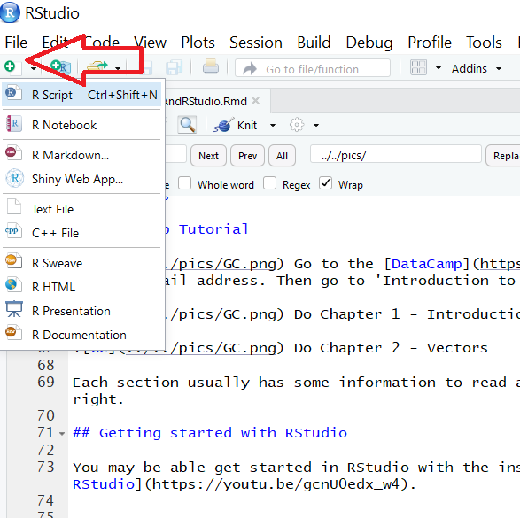
Make a new script file called workshop7.R to carry out the rest of the work.
Load packages
You probably want to load the tidyverse with library(tidyverse).
Parasites on two species of periwinkle
This example is about the effect of season on the parasite load of two species of periwinkle.

photo of periwinkles
A group of amateur conchologists have collected live specimens of two species of rough periwinkle (intertidal, gastropod molluscs) from sites in northern England in the Spring (1) and Summer (2). Among other variables, they take a measure of the gut parasite load. Number of parasites is related to the number of parasites seen on a slide of gut contents and larger numbers indicate a higher parasite load. The data are in SPSS file called periwinkle.sav. SPSS is a well known commercial statistical package.
There are several R packages that allow to read in data in different file formats. My personal favourite is haven. If you are working on your own pc you will need to install it, but it is already installed on the university system.
Load haven with a library statement
Now we can read the SPSS file in using one of the functions from haven. Look it up in the manual ?read_sav
Save a copy of periwinkle.sav to you raw_data folder and import it with read_sav():
## Observations: 100
## Variables: 3
## $ para    <dbl> 58, 51, 54, 39, 65, 67, 60, 54, 47, 66, 51, 43, 62, 55...
## $ season  <dbl+lbl> 1, 1, 1, 1, 1, 1, 1, 1, 1, 1, 1, 1, 1, 1, 1, 1, 1,...
## $ species <dbl+lbl> 1, 1, 1, 1, 1, 1, 1, 1, 1, 1, 1, 1, 1, 1, 1, 1, 1,...
The values used in the SPSS file were labelled integers and the read_sav() has made them objects of type “haven_labelled”. You can see this with str(periwinkle$season)
The labels of these can be viewed in R using:
## Spring Summer
## 1 2## Littorina saxatilis Littorina nigrolineata
## 1 2 And the “haven_labelled” type of variables can be made factors using:
This will replace those integers with the actual labels which will make your analysis and plots easier to understand.
It’s often a good idea to save a copy of your processed and now analysis-ready data. We save write to files using write.table()
Write the dataframe to a plain text format file in your processed_data folder:
Exploring
 What type of variable is ‘para’? What are the implications for the test?
Do a quick plot of the data. We have two explanatory variables so whilst one can be mapped to the x-axis as was the case for t-test and ANOVA scenarios, the other needs to be mapped to the ‘colour’ or ‘fill’ aesthetics.

Calculate summary statistics on parasite for each species-season combination. You’ve calculated summary statistics on a response for a single explanatory before. Adding an additional explanatory variable is straightforward with the group_by() function. We just add the additional variable to the function:
perisum <- periwinkle %>%
  group_by(season, species) %>%
  summarise(mean = mean(para),
            median = median(para),
            sd = sd(para),
            n = length(para),
            se = sd / sqrt(n))
Make sure you have assigned the output as you will need it later for plotting.
Our plotting and summarising exploration gives us an idea of what we expect to find on statistical analysis.
What three effects can we test with these data using a two-way ANOVA?
Applying, interpreting and reporting
We now carry out a two-way ANOVA assigning the result of the aov() procedure to a variable and examining it with summary(). We put a * between the predictors (‘independent’ or ‘grouping’ variables) to indicate we want to consider both factors AND the interaction.
Create the ANOVA model with both main effects and the interaction:
##                Df Sum Sq Mean Sq F value   Pr(>F)
## season          1   3058  3058.1  25.580 2.03e-06 ***
## species         1     90    90.2   0.755   0.3871
## season:species  1    724   723.6   6.053   0.0157 *
## Residuals      96  11477   119.6
## ---
## Signif. codes:  0 '***' 0.001 '**' 0.01 '*' 0.05 '.' 0.1 ' ' 1
What do you conclude so far from the test?
We have significant effects but which means differ? We need a post-hoc test. A post-hoc (“after this”) test is done after (and only after) a significant ANOVA test. The ANOVA tells you at least two of means differ, the post-hoc test tells you where the differences are. There are several possible post-hoc tests. A popular option is the Tukey Honest Significant Difference test.
Carry out a Tukey HSD with:
##   Tukey multiple comparisons of means
##     95% family-wise confidence level
##
## Fit: aov(formula = para ~ season * species, data = periwinkle)
##
## $season
##                diff      lwr      upr p adj
## Summer-Spring 11.06 6.719279 15.40072 2e-06
##
## $species
##                                            diff       lwr      upr
## Littorina nigrolineata-Littorina saxatilis  1.9 -2.440721 6.240721
##                                                p adj
## Littorina nigrolineata-Littorina saxatilis 0.3870918
##
## $`season:species`
##                                                              diff
## Summer:Littorina saxatilis-Spring:Littorina saxatilis       16.44
## Spring:Littorina nigrolineata-Spring:Littorina saxatilis     7.28
## Summer:Littorina nigrolineata-Spring:Littorina saxatilis    12.96
## Spring:Littorina nigrolineata-Summer:Littorina saxatilis    -9.16
## Summer:Littorina nigrolineata-Summer:Littorina saxatilis    -3.48
## Summer:Littorina nigrolineata-Spring:Littorina nigrolineata  5.68
##                                                                    lwr
## Summer:Littorina saxatilis-Spring:Littorina saxatilis         8.354141
## Spring:Littorina nigrolineata-Spring:Littorina saxatilis     -0.805859
## Summer:Littorina nigrolineata-Spring:Littorina saxatilis      4.874141
## Spring:Littorina nigrolineata-Summer:Littorina saxatilis    -17.245859
## Summer:Littorina nigrolineata-Summer:Littorina saxatilis    -11.565859
## Summer:Littorina nigrolineata-Spring:Littorina nigrolineata  -2.405859
##                                                                   upr
## Summer:Littorina saxatilis-Spring:Littorina saxatilis       24.525859
## Spring:Littorina nigrolineata-Spring:Littorina saxatilis    15.365859
## Summer:Littorina nigrolineata-Spring:Littorina saxatilis    21.045859
## Spring:Littorina nigrolineata-Summer:Littorina saxatilis    -1.074141
## Summer:Littorina nigrolineata-Summer:Littorina saxatilis     4.605859
## Summer:Littorina nigrolineata-Spring:Littorina nigrolineata 13.765859
##                                                                 p adj
## Summer:Littorina saxatilis-Spring:Littorina saxatilis       0.0000041
## Spring:Littorina nigrolineata-Spring:Littorina saxatilis    0.0932018
## Summer:Littorina nigrolineata-Spring:Littorina saxatilis    0.0003558
## Spring:Littorina nigrolineata-Summer:Littorina saxatilis    0.0198124
## Summer:Littorina nigrolineata-Summer:Littorina saxatilis    0.6749008
## Summer:Littorina nigrolineata-Spring:Littorina nigrolineata 0.2626986
We have three bits of output, eaching corresponding to the three null hypotheses. There is a siginificant difference between the season with a difference between the means of 11.1 parasites.We then have significant comparions between: Spring and Summer for L. saxatilis; L.nigrolineata in the Summer and L.saxatilis in the Spring; L.nigrolineata in Spring and L.saxatilis in Summer.
Checking selection
Check the assumptions of the test by looking at the distribution of the ‘residuals’.
Illustrating
Producing a figure to go with this result using ggplot2. We will again need the means and standard errors calculated earlier and stored in perisum
We are going to create a figure like this:

Figure 1. The effect of season on the parasite load in two species of periwinkle. Thick lines give the means and error bars are \(\pm\) 1 S.E.
We will plot the means and error bars. Look this up in the Oneway ANOVA workshop.
Let’s try doing the same here
ggplot() +
  geom_point(data = periwinkle, aes(x = season, y = para),
             position = position_jitter(width = 0.1, height = 0),
             colour = "gray50") +
  geom_errorbar(data = perisum,
                aes(x = season, ymin = mean - se, ymax = mean + se),
                width = 0.4, size = 1) +
  geom_errorbar(data = perisum,
                aes(x = season, ymin = mean, ymax = mean),
                width = 0.3, size = 1 )
How can we show the species separately?
We can map the species variable to the shape aesthetic!
ggplot() +
  geom_point(data = periwinkle, aes(x = season, y = para, shape = species),
             position = position_jitter(width = 0.1, height = 0),
             colour = "gray50") +
  geom_errorbar(data = perisum,
                aes(x = season, ymin = mean - se, ymax = mean + se),
                width = 0.4, size = 1) +
  geom_errorbar(data = perisum,
                aes(x = season, ymin = mean, ymax = mean),
                width = 0.3, size = 1)
Oh, that isn’t quite what we want! We want the species side-by-side, not on top of each other.
We can achieve that by using setting the position argument position_jitterdodge() in the geom_point() and to position_dodge() in the two geom_errorbar(). We also have to specify that the error bars are grouped by species since they are not otherwise mapped to a shape, colour or fill.
ggplot() +
  geom_point(data = periwinkle, aes(x = season, y = para, shape = species),
             position = position_jitterdodge(dodge.width = 1,
                                             jitter.width = 0.4,
                                             jitter.height = 0),
             colour = "gray50") +
  geom_errorbar(data = perisum,
                aes(x = season, ymin = mean - se, ymax = mean + se, group = species),
                width = 0.4, size = 1,
                position = position_dodge(1)) +
  geom_errorbar(data = perisum,
                aes(x = season, ymin = mean, ymax = mean, group = species),
                width = 0.3, size = 1,
                position = position_dodge(1))
Finally we add axis labels, specify the y-axis limits and add theme_classic(). I’ve also altered the legend position.
ggplot() +
  geom_point(data = periwinkle, aes(x = season, y = para, shape = species),
             position = position_jitterdodge(dodge.width = 1,
                                             jitter.width = 0.4,
                                             jitter.height = 0),
             colour = "gray50") +
  geom_errorbar(data = perisum,
                aes(x = season, ymin = mean - se, ymax = mean + se, group = species),
                width = 0.4, size = 1,
                position = position_dodge(width = 1)) +
  geom_errorbar(data = perisum,
                aes(x = season, ymin = mean, ymax = mean, group = species),
                width = 0.3, size = 1,
                position = position_dodge(width = 1) ) +
  ylab("Number of parasites") +
  ylim(0, 125) +
  xlab("Season") +
  theme_classic() +
  theme(legend.title = element_blank(),
        legend.position = c(0.2, 0.2))
We are nearly there!
Now you add the annotation for the post-hoc result. You may want to look up last week’s workshop.
Use ggsave() to save your figure to file. You can use what ever format you prefer (png, jpg, tiff eps). You may want to look up last week’s workshop.
Independent study
Analysis
Fertilising a crop with Nitrogen and Potassium
The STATA file yield.dta contains data from a two-factor design in which crop yield (in kilograms) was determined from plots treated with low and high levels of nitrogen and low and high levels of potassium. Analyse these data as you see fit and write up the results including some appropriate figures and/or tables. You will need to:
- use an RStudio project to organise the analysis and create appropriate folders for the data and figures.
- read in the data
- make any changes needed to analyse the data
- graphically explore and summarise the data
- carry out an analysis
- check the validity of the analysis
- report the results including a figure
- give a conclusion about the effect of the two fertilisers on growth

Reading
Chapter 2 Project-oriented workflow of What they forgot to teach you about R (Bryan and Hester, n.d.).
The Code files
These contain answers and code even though they do not appear on the webpage itself.
Rmd file The Rmd file is the file I use to compile the practical. Rmd stands for R markdown allow R code and ordinary text to be inter weaved to produce well-formatted reports including webpages.
Plain script file This is plain script (.R) version of the practical
Script example
This is an example of a well formatted analysis script for one of the independent study problems.
Objectives from previous sessions
Introduction to module and RStudio
- to explain why we need statistical tests and the logic of hypothesis testing (MLO 1)
- use the R command line as a calculator and to assign variables (MLO 3)
- create and use the basic data types in R (MLO 3)
- find their way around the RStudio windows (MLO 3)
- create, use and save a script file to run r commands (MLO 3)
- search and understand manual pages (MLO 3)
Testing, Data types and reading in data
- to able to explain what response and explanatory variables are, distinguish between data types and describe how these impact choice of test (MLO 1 and 2)
- demonstrate the process of hypothesis testing with an example and evaluate potential inferences (MLO 1 and 2)
- read in data in to RStudio, create simple summaries and plots using manual pages where necessary (MLO 3)
- create neat reports in Word which include text and figures (MLO 4)
Goodness of Fit and Contingency chi-squared tests
- recognise when to use chi-squared Goodness of Fit and Contingency tests (MLO 2)
- be able to carry out, interpret and report scientifically both types of test by hand and in R (MLO 3 and 4)
Calculating summary statistics, probabilities and confidence intervals
- Explain the properties of ‘normal distributions’ and their use in statistics (MLO 1 and 2)
- Define, select and calculate with R probabilities, quantiles and confidence intervals (MLO 3 and 4)
- Explain dependent and independent samples (MLO 2)
- Select, appropriately, t-tests and their non-parametric equivalents (MLO 2)
- Apply, interpret and evaluate the legitimacy of the tests in R (MLO 3 and 4)
- Summarise and illustrate with appropriate R figures test results scientifically (MLO 3 and 4)
One-way ANOVA and Kruskal-Wallis
- Explain the rationale behind ANOVA and complete a partially filled ANOVA table (MLO 1 and 2)
- Apply (appropriately), interpret and evaluate the legitimacy of, one-way ANOVA and Kruskal-Wallis including post-hoc tests in R (MLO 2, 3 and 4)
- Summarise and illustrate with appropriate R figures test results scientifically (MLO 3 and 4)

References
Bryan, Jennifer, and Jim Hester. n.d. “Chapter 2 Project-Oriented Workflow | What They Forgot to Teach You About R.” https://whattheyforgot.org/project-oriented-workflow.html.